
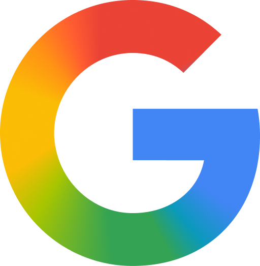
After ten years with the same logo — those four solid color blocks that looked sturdy enough to survive a small apocalypse — Google decided it was time for a change. And what was that big change, exactly? Blurring the colors together.
Yes. Blurring them.
The announcement arrived wrapped in the usual corporate language: the new "G" reflects Google's evolution in the age of AI. At this point you half expect the next update to ship with a press release explaining how a gradient represents "the fluidity of algorithmic thought," or something equally solemn.
From LEGO Blocks to Cake Frosting
The 2015 logo was almost austere: blue, red, yellow, green, each color in its own lane, never touching, like coworkers who get along fine but would never share a Tupperware. The new logo, by contrast, melts those colors into one another with soft transitions, aligning the whole thing with Gemini's aesthetic. The result is a "G" that looks less like a corporate wordmark and more like watercolors left out in the rain.
Is it more modern? Sure. Is it more "friendly" and "glassmorphic," as the design press releases love to say? Also yes. Can anyone outside a branding studio explain in one sentence why this needed to happen? That's a separate question entirely.
It's Not Just the Logo — It's the Whole Family
Here's the part that makes this feel less like a logo tweak and more like a full-blown family portrait redo: Google didn't just update the search homepage wordmark. The gradient treatment has been quietly rolling out across the entire app suite — Gmail, Google Drive, Google Home, all getting the same soft-glow makeover, with rounder corners and blended color transitions instead of the old sharp-edged blocks.
Gmail's iconic "M" shape survives, but the flat color segments are gone, replaced by glowing transitions — a pinkish-red here, a lime-to-blue blend there. Drive went even further: it quietly dropped red from its icon altogether, leaving blue, green, and yellow to run the show. Ten years of visual identity, and one color just... didn't make the cut. Nobody asked red how it felt about that.
The "Sameness" Problem, a Silent Villain
One of the official reasons behind all this is solving what designers call "sameness" — with so many colorful square icons competing for space on your phone's home screen, Google wants its apps to pop a little harder than the rest. It's essentially the corporate equivalent of raising your voice at a loud party so people notice you. You're not saying anything different, just turning up the volume.
And to be fair, it works — gradients really do pop more on an OLED screen. But it also means that opening your phone now feels like Google redecorated the whole house in one weekend and left a note saying it's "an evolution," not a renovation.
So, Now What?
The new look started appearing in the Google app on Android and iOS back in May, and since then it's been spreading quietly across the rest of the Google universe — Gmail, Drive, Home, and beyond — all sporting the same gradient glow and softened edges. Less like a logo change, more like a software update, but for your eyeballs.
Maybe it doesn't need to be overanalyzed. It's still a G. Still (mostly) the same four colors. They just get along better now, like they went to corporate couples therapy together.
One thing's for sure: in another ten years, when Google announces its next redesign, it'll probably bring back the solid color blocks from 2015 and call it "a bold return to clarity." That's how design works — it doesn't move in a straight line, it just goes in circles with a new press release each time.